From static documentation to an AI-ready production system
Titan v2. Tokens, components, Storybook, code, and the rules agents follow, in one workflow. A standard screen now goes from brief to a reviewed pull request in about 40 minutes, without breaking what is already in production.
- Role
- Head of Design, owner of the system
- Team
- 2 designers, 2 front-end engineers (part-time)
- Timeline
- v1 2020 – 2023 · v2 Mar 2025 – in production 2026
- Stack
- Tokens, React, CSS layers, Storybook, agent rules (MCP)
- From brief to a reviewed pull request for a standard screen (was ~3 days)
- ~40 min
- From brief to a reviewed pull request for a standard screen (was ~3 days)
- Of UI in Audience Intelligence App built from system components
- 86%
- Of UI in Audience Intelligence App built from system components
- Visual regressions in production from library updates across 14 releases
- 0
- Visual regressions in production from library updates across 14 releases
- Design QA issues filed per release
- −61%
- Design QA issues filed per release
Where it started: Titan v1
I led the first version as Lead Product Designer. It did its job: one library across the products that came before Audience Intelligence App.
- 200+
- Components in the v1 library
- 7
- Products using it
- ~40%
- Less time from design to development
Why v1 was not enough
v1 was documentation that engineers translated by hand. Three things broke as we unified the products and started building with AI: every unplanned tweak needed a new token, library updates changed screens already in production, and agents writing UI invented their own conventions because nothing told them ours. Speed was going up and quality was going down.
Key decisions
Two layers, not tokens alone
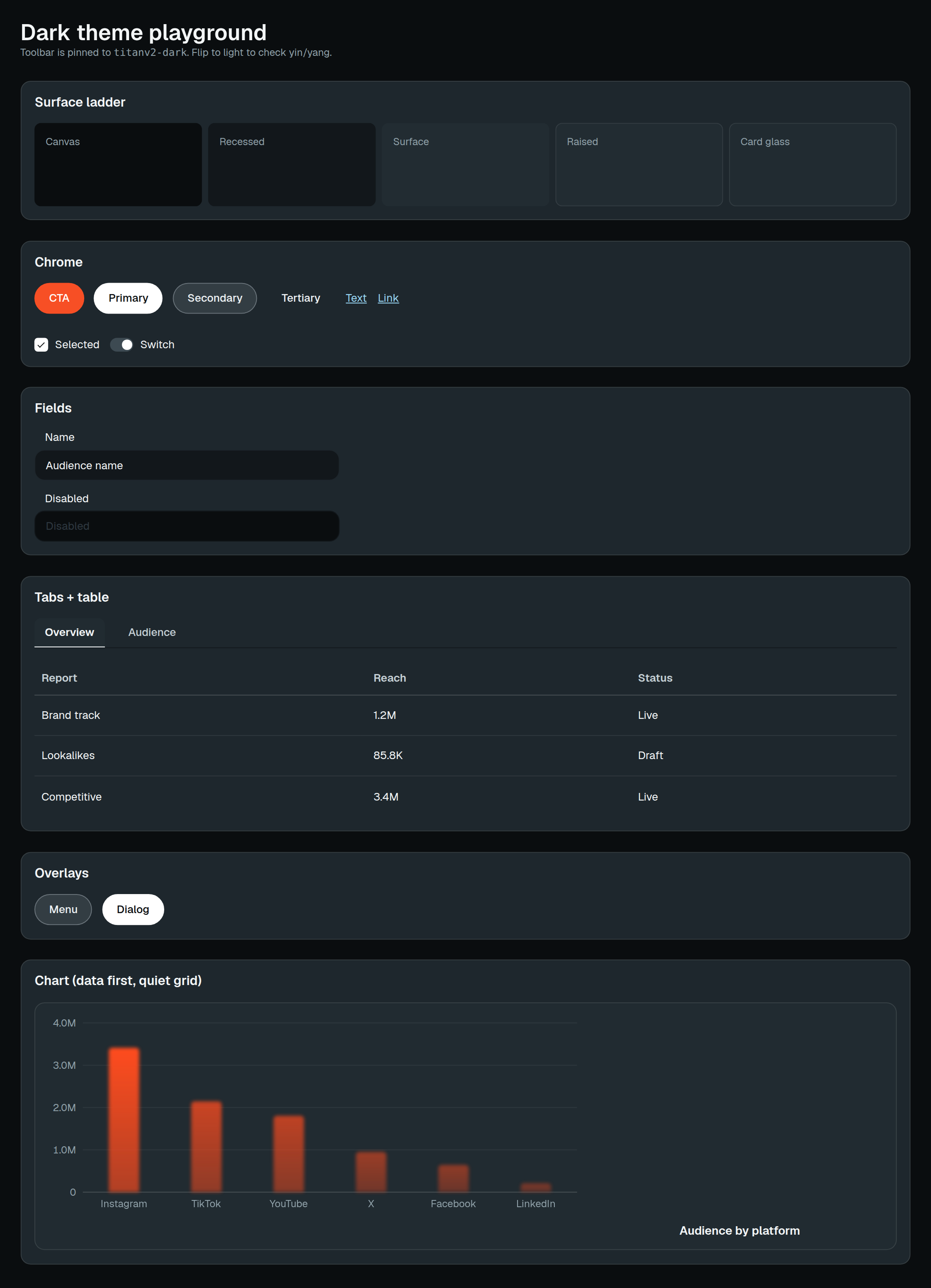
A token sheet only changes what someone tokenized beforehand. Every unplanned adjustment in v1 meant a ticket for a developer to add a token: 63 of them in 2024. v2 has semantic tokens for what is global (palette, type, spacing, radii) and CSS rules per component for what no token covers. A whole theme changes in one file.
CSS-layer isolation
In v1, a library update could change screens already in production, so teams pinned old versions and drifted. v2 isolates versions with CSS layers. Teams now upgrade within a week of a release instead of skipping two or three.
Rules agents read before they act
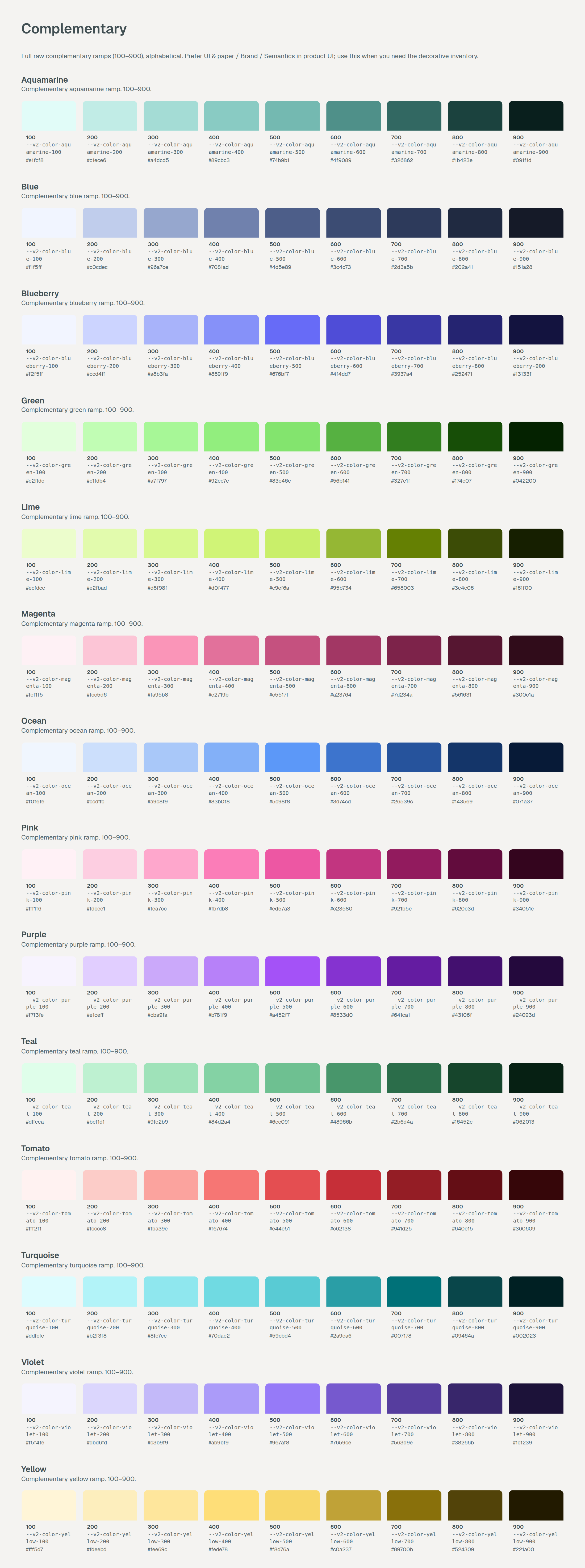
An agent with no rules invents a parallel convention. Version 2 ships the rules with the components: typography, vertical rhythm, color, motion, icons, and layout, served to agents through MCP alongside Storybook. The agent builds with our parts or it does not build.
Fewer components, stricter ones
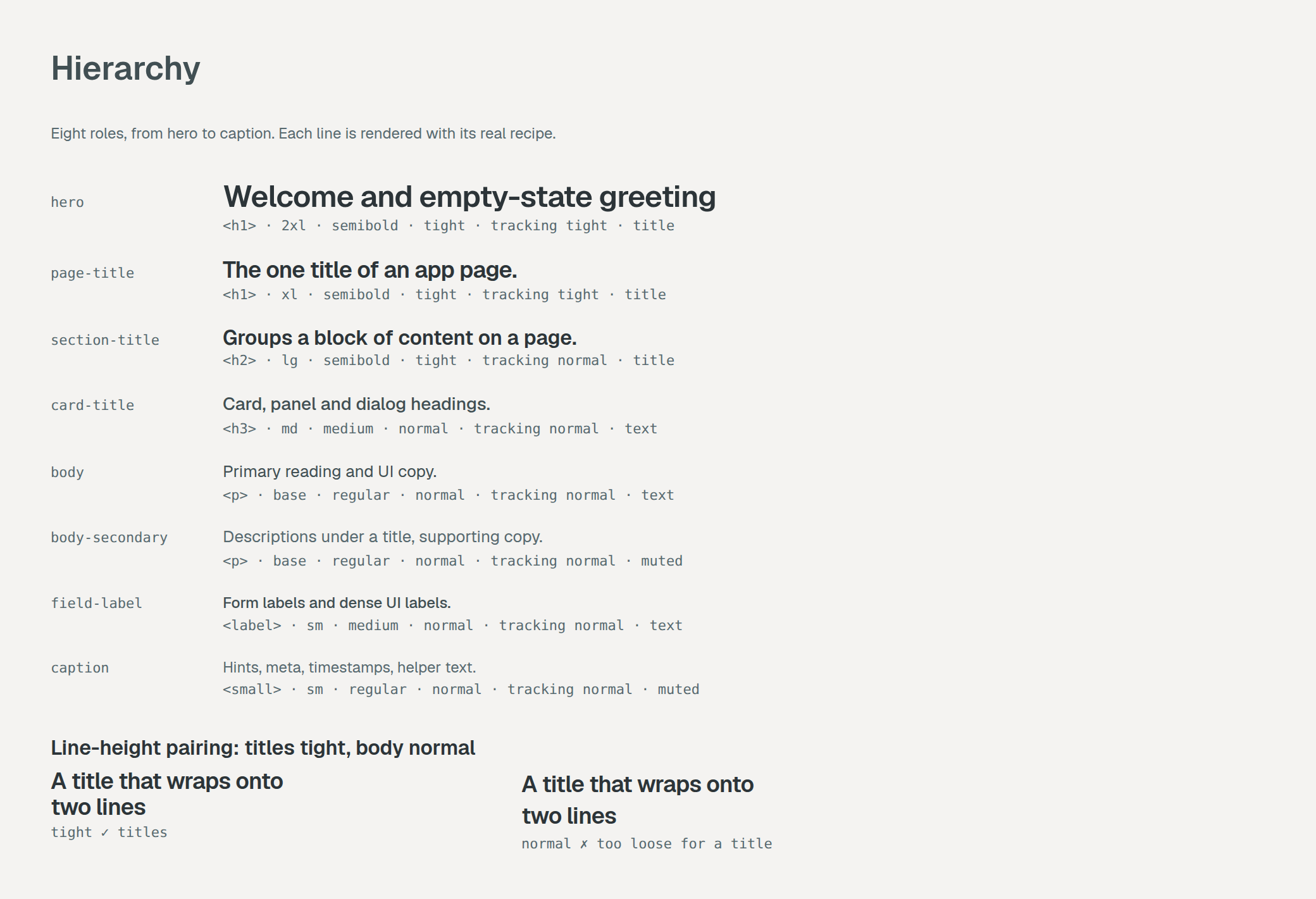
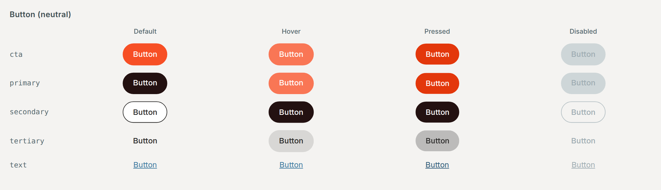
v1 grew to 214 components, many of them near-duplicates. v2 has 118. Each one has a contract, live examples, and eight type roles with line height, measure, and tabular numbers documented in Storybook.
The workflow
The system is not a library people consult. It is the path an interface takes to production.
- 01
Brief
A designer or PM describes the screen, or points at a Figma frame.
- 02
Generate
The agent reads the component contracts and rules through MCP and writes the screen in code.
- 03
Validate
Lint rules and visual tests reject anything outside the system: raw colors, off-scale spacing, unknown components.
- 04
Review
A designer reviews the running screen in a preview, not a mockup, and a front-end engineer merges it.
Results
A standard screen (a list, a detail view, a settings page) goes from brief to a reviewed pull request in about 40 minutes. In v1 the same screen took around three days between design, handoff, and build. Complex flows still take design time, and should.
86% of the UI in Audience Intelligence App is built from system components, measured by a code scan. Design QA issues per release fell 61%, and library updates have caused zero visual regressions in production across 14 releases.
What I did
- The v2 architecture: the two-layer contract, CSS-layer isolation, the agent rules
- The type system and the eight roles
- The pilot: rebuilding three screens of Audience Intelligence App to prove the workflow
- Making the case to the CTO for two part-time front-end engineers
What the team did
- Component design and documentation: a product designer on the team
- React implementation, visual tests, and the MCP server: two front-end engineers
- Migration of each product: the product squads, with office hours from us